Discover is a fairly new entrant into the market and the process of setting up APIs can be tedious due to the legal requirements. They expressed great concern over the user experience of the product.
How might we design a portal that instills confidence in users and minimizes confusion during the API setup process?
User: My goal is to create a seamless & informative experience where users feel consistenly informed and empowered throughout the entire process.
Business: Our goal is to ensure users' frustrations are minimized to ensure they complete the process with ease and efficiency. Additionally, I wanted to create something that exceeded competitors' current designs.

intuitive navigation
Create a clear & user friendly navigation to ensure users can access what they need

user-focused
Provide documentation that caters to the needs of developers & product managers
comprehensive support
Establish channels for users to promptly access support to address queries,
By the time I joined the project, the team got approval of the service blueprint they created for the client. I started out by creating a site map based off the blueprint to gain a high level view of the product we're creating.

After laying out the structure, we worked with DFS to identify the key areas of focus for the deliverables. Our choices were based on key areas in the user experience & the anticipated complexity the stakeholders were anticipating.
How might we help busy individuals cook an enjoyable meal efficiently in the kitchen?
nailing the user experience
I spent the next few weeks designing out the low fidelity wireframes to establish the user experience. We kept an ongoing dialogue with the client, meeting with them roughly twice a week for 3 weeks to get feedback. Below is an example of the different concepts I created for the navigation.
We decided to go with the first concept as it was the most intuitive for the stakeholders to follow and it differentiated itself from competitor designs.
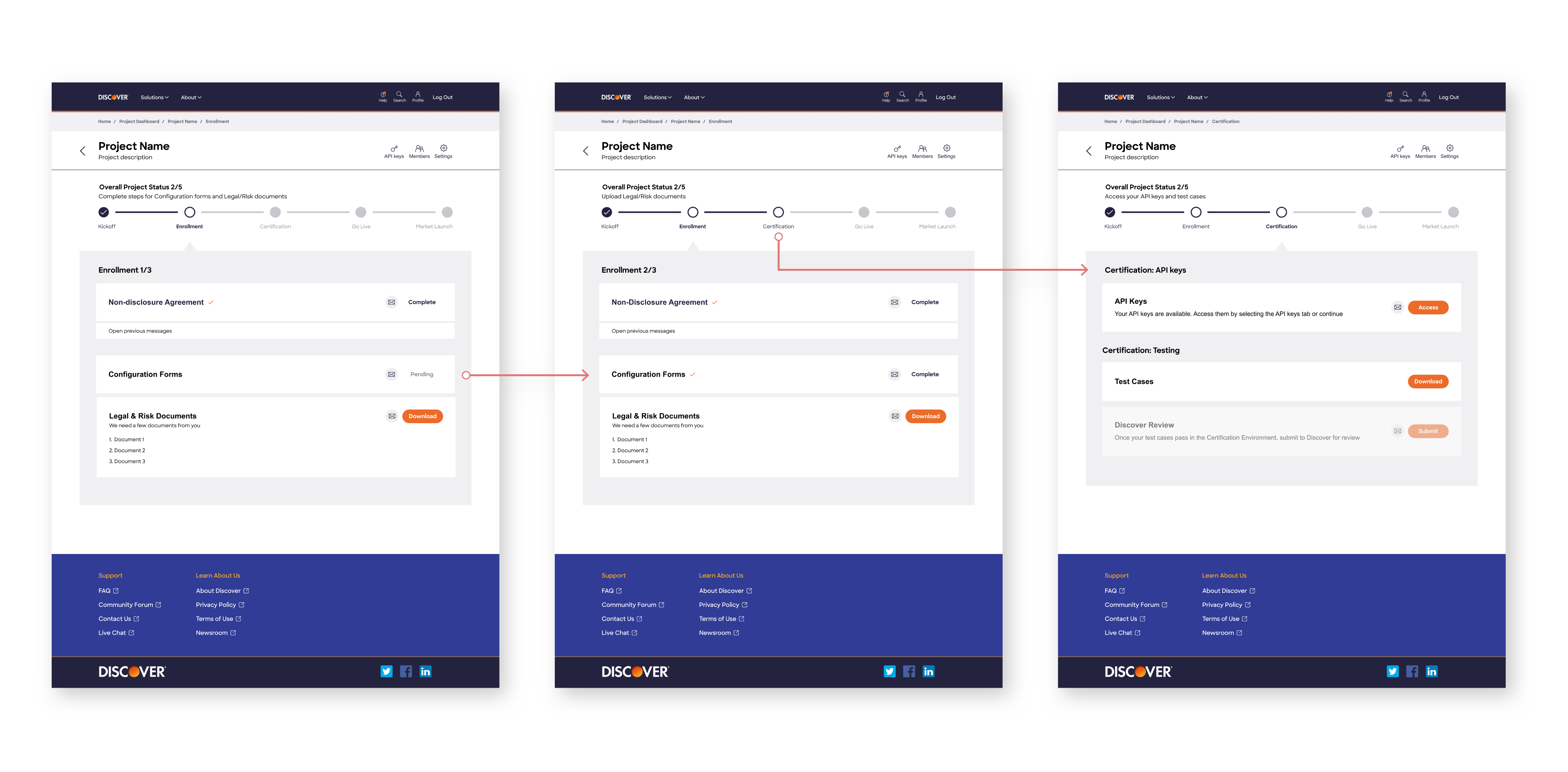
the api set up process is not linear
How might we minimize potential confusion/frustration for users?
The process incorporates conditional logic, allowing future steps to unlock based on the user's previous actions.
I wanted to ensure that users could complete as much information as possible without getting lost.
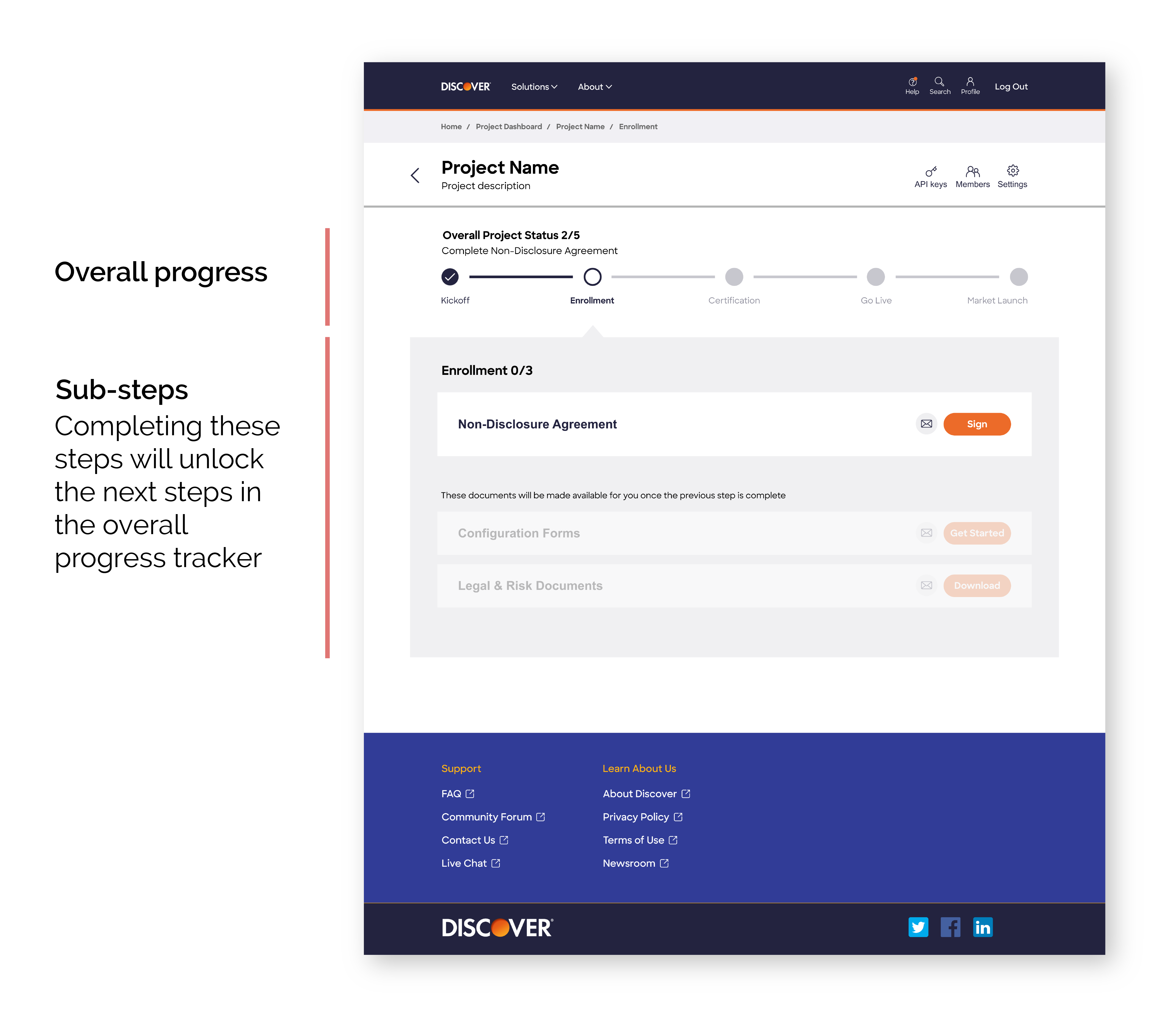
overall progress
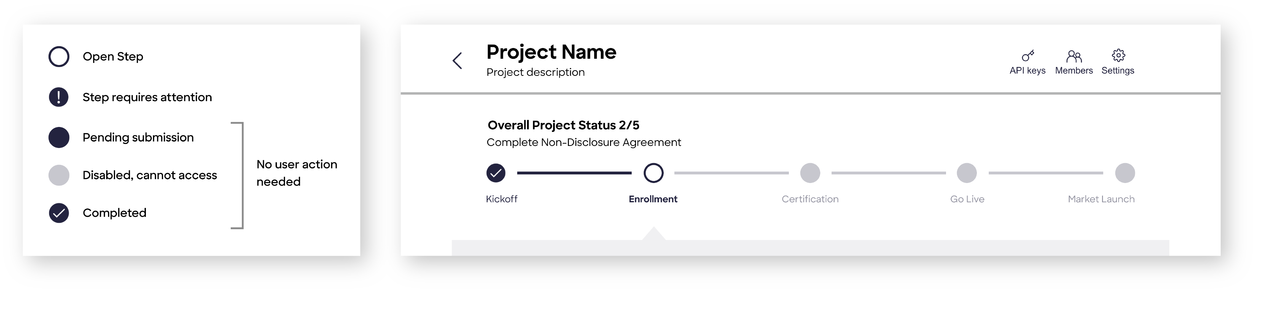
I added an overall navigation tracker at the top. The left picture shows what each step means. To ensure it was accessible, I designed it to not rely on color.
The right image shows the overall progress tracker. At the top, it informs the user how many of the actual steps in the process the user has completed and right below, what action item they need to complete.
sub-steps
Below is an example of where the process incorporates conditional logic. By utilizing the navigation tracker at the top, this makes it clear for users on what they can access.
P3 enables users to utilize multiple APIs in 1 project
How might we make that clear?
Discover describes it as a "shopping cart" experience. I approached this by utilizing consistent language across the portal with the word "build".
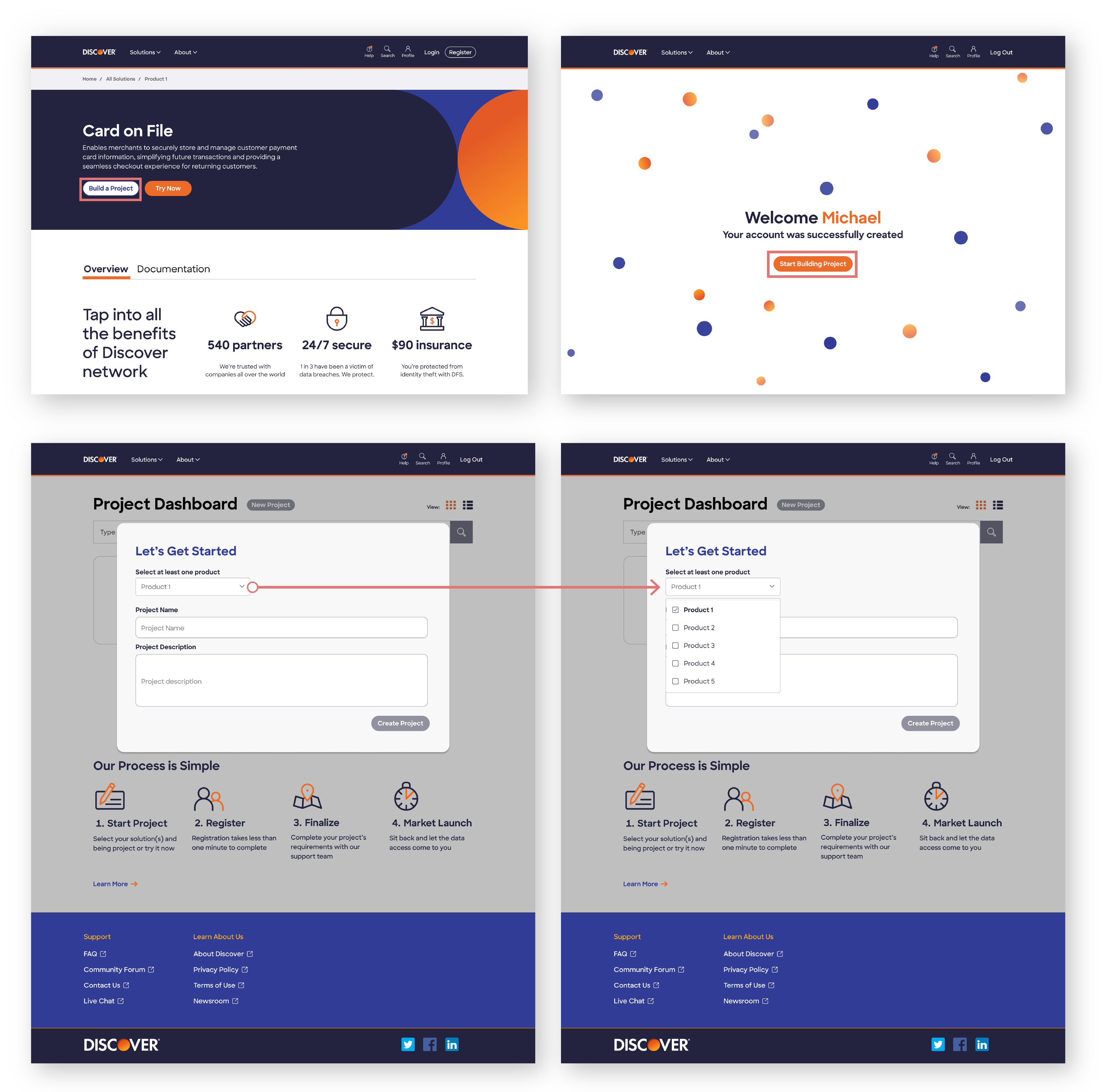
By strategically incorporating the word "build" and implementing a feature that enables users to select multiple items before creating a project, we're conveying to users that they have the option to utilize more than one product in their project, enhancing flexibility and customization possibilities.
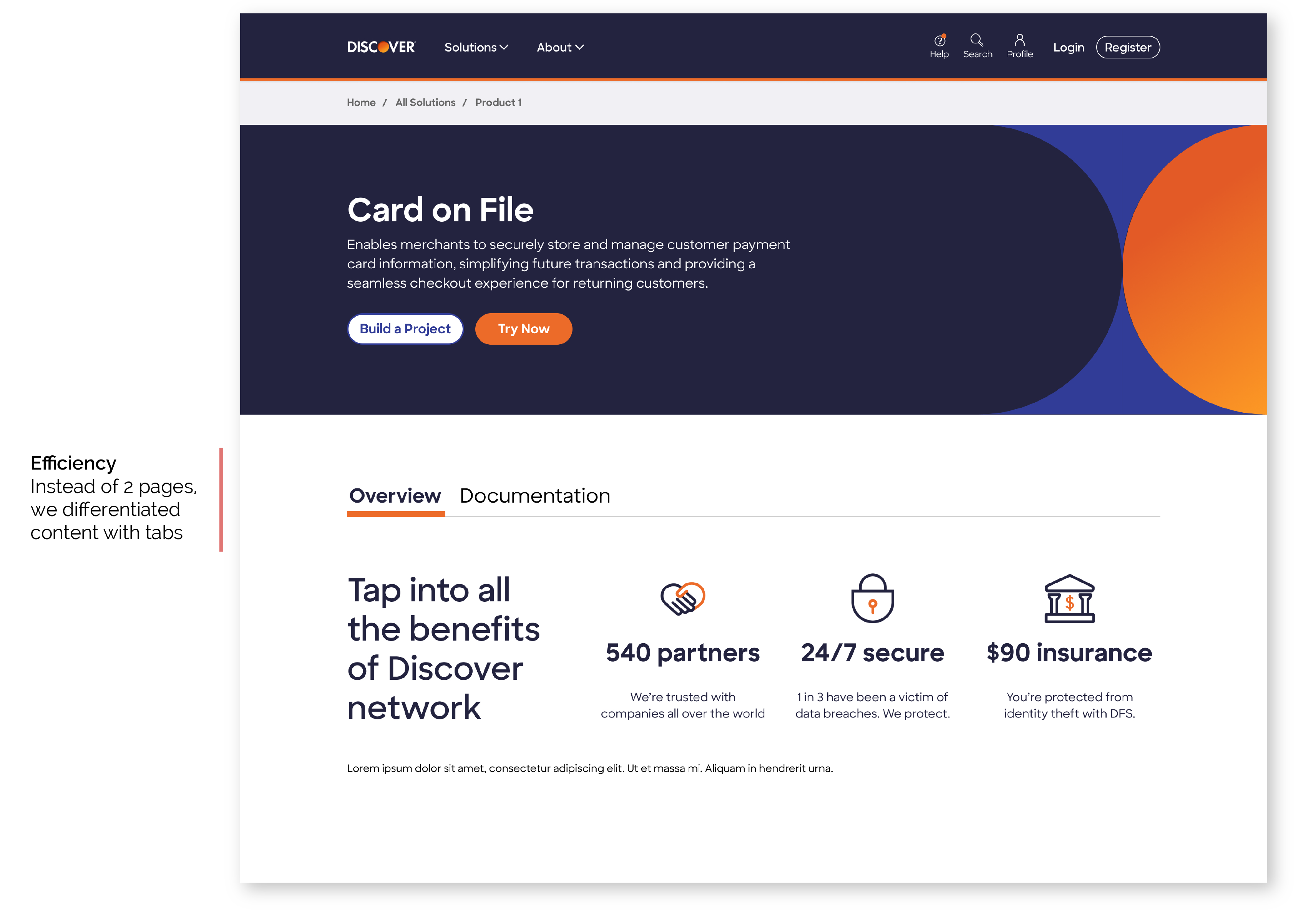
p3 targets 2 primary user groups
How might we target these groups efficiently?
I noticed competitors addressed this problem by creating the main page for product managers. If the user wanted to access the developer content, they would click a link to load a new page.
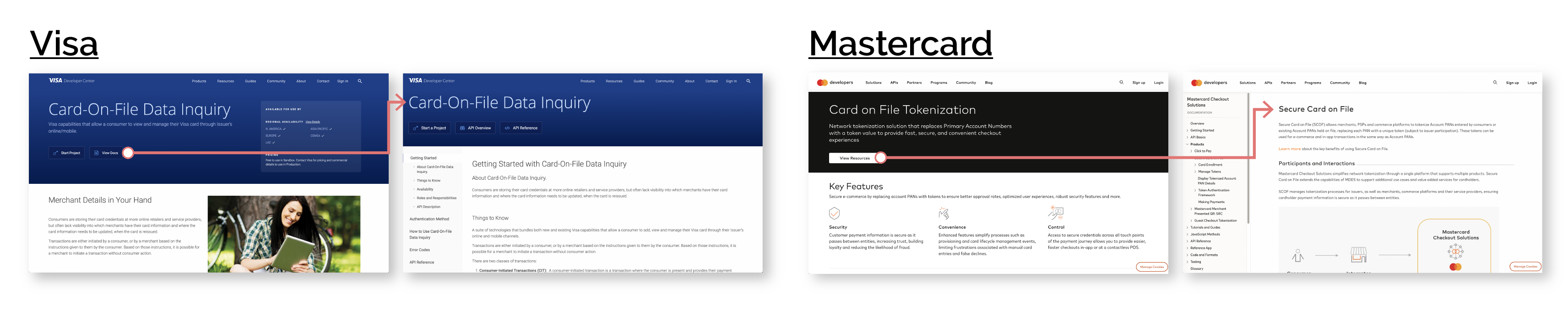
efficient build
To make our design more efficient and user-friendly, we differentiated the material with tabs, reducing loading time and eliminating the need to build a whole new page.
Discover's p3 support team will be limited
While Discover will have a support team to help users throughout the setup process, they won't be able to reply immediately.
I set up expectations by switching the icon from a chat bubble to a letter mail one and the send arrow to a "send message" button.
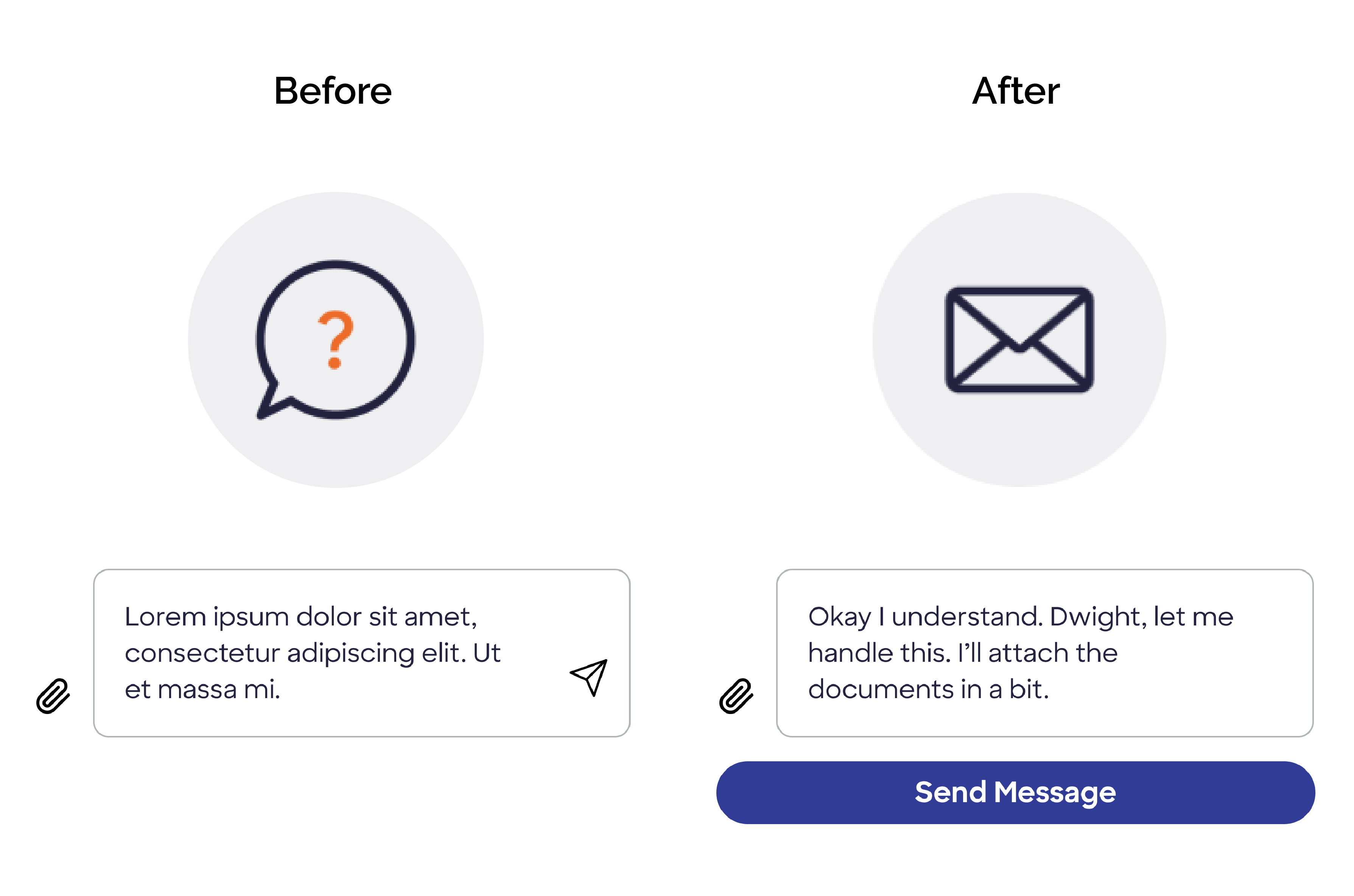
I also utilized the UX principle of transparency to set clear expectations for users on when they should expect a reply as shown below.
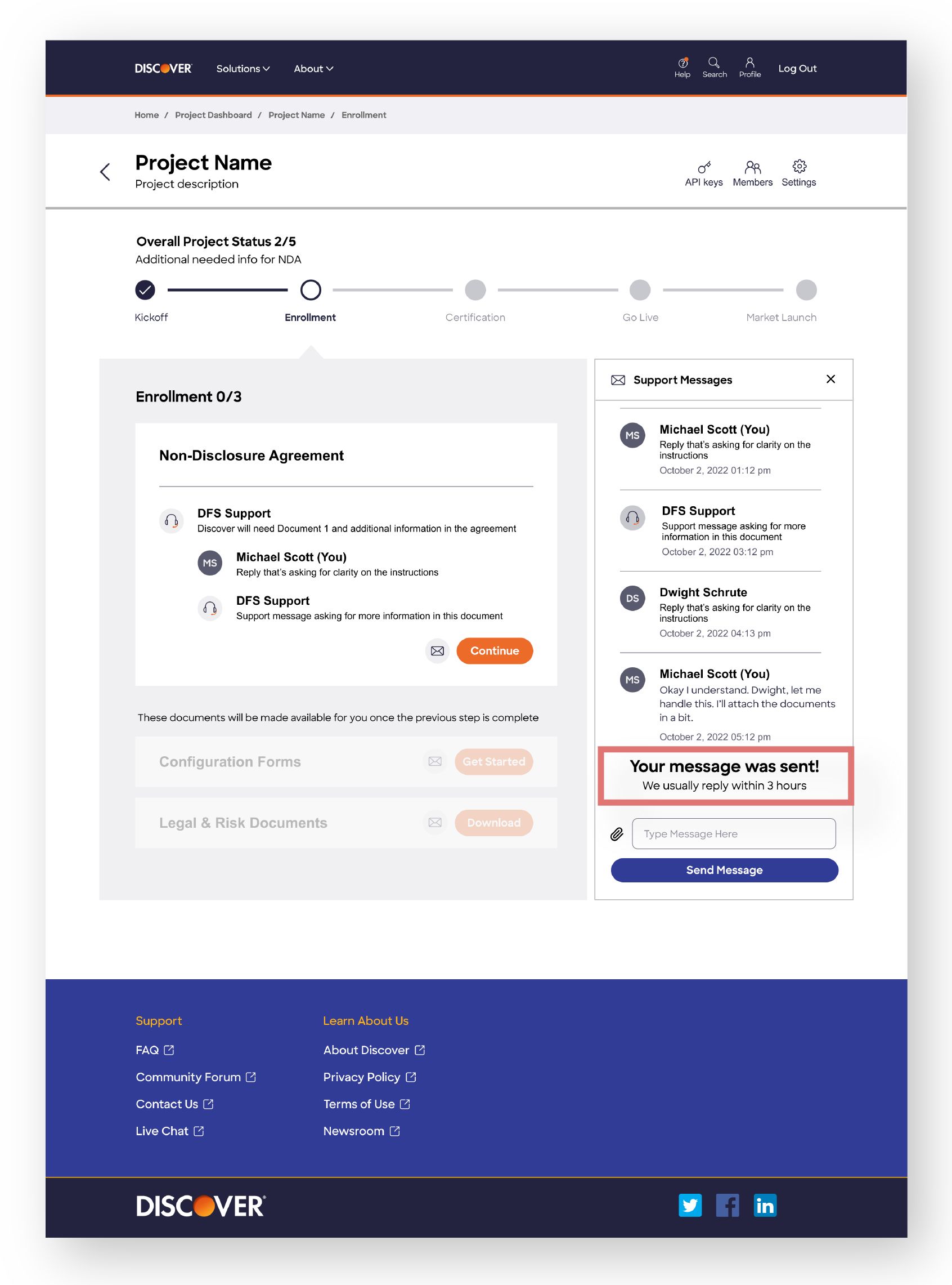
Straight forward path for creating a project. We made sure to keep onboarding simple and delightful.
Here, I ensure that users are supported every step of the process. They could either message Discover themselves, or if there’s a problem, Discover’s message will appear at the step in progress.